
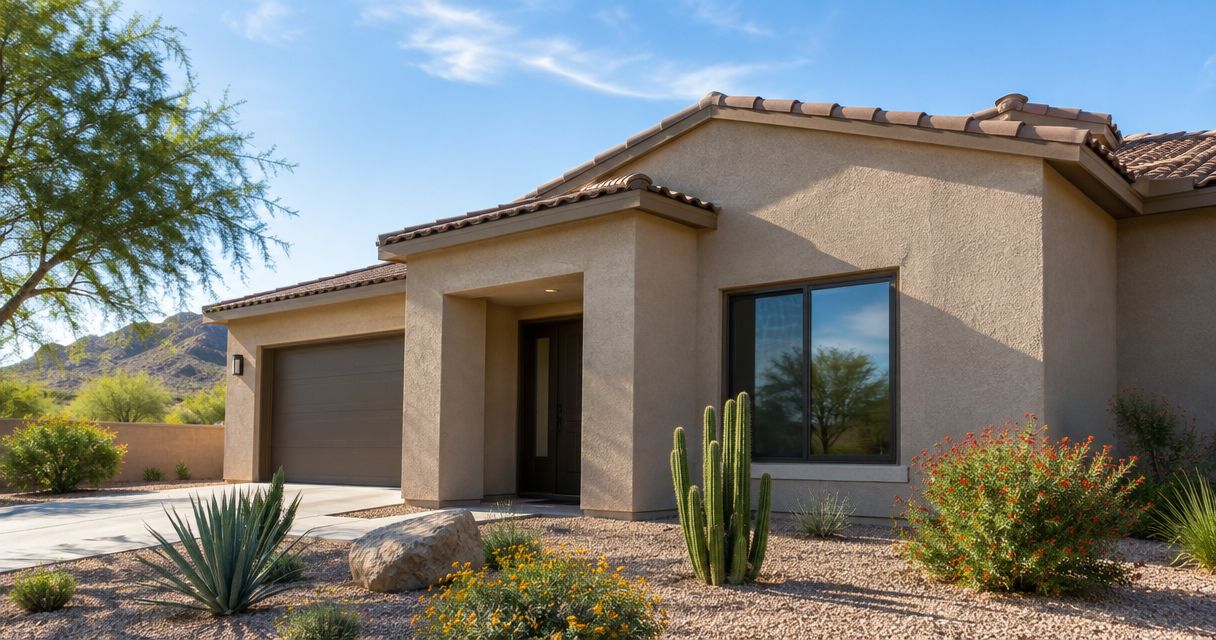
Best overall: warm off-white. Best for a warm-toned tile roof: sandy beige. Best for a Southwestern statement: muted terracotta. The best stucco colors for Phoenix homes in 2026 start with your roof, stonework, and daylight—not a small color chip viewed indoors.
- Warm off-white leads the stucco colors for Phoenix homes shortlist when you want a restrained, flexible exterior palette.
- Sandy beige suits warm roof tiles; warm greige helps connect mixed warm and cool exterior materials.
- Muted terracotta, dusty sage, and deep charcoal serve distinct roles rather than competing as universal choices.
- Azstuccosolutions provides stucco installation, repair, and restoration for residential and commercial properties in the Phoenix metro area.
- Compare large samples on the actual wall before choosing an exterior color.
Why this matters
A stucco color has to work with materials you are keeping. Roof tile, masonry, window frames, and paving belong in the decision before a new front-door color does. A shade that works beside one roof can look disconnected beside another.
Color also does not solve surface damage. If your project includes cracks, damaged areas, or restoration, discuss that work before selecting the final finish. Azstuccosolutions provides stucco installation, repair, and restoration in the Phoenix metro area; confirm the finish and color process for your specific project.
What makes the best stucco colors for Phoenix homes?
Use these criteria to build your 2026 shortlist. They matter more than whether a shade appears on a trend list.
- Fixed-material compatibility: Start with the roof, stone, brick, and window frames that will remain.
- Undertone consistency: Compare yellow, pink, gray, and green undertones directly against those materials.
- Daylight appearance: View samples in direct sun and shade, not only on a screen.
- Surface texture: Assess color on a texture representative of the finished wall.
- Visual hierarchy: Decide which color belongs on the main walls and which belongs on smaller features.
- Neighborhood requirements: Check any applicable association rules before committing to a palette.
Warm off-white is the best default stucco color for Phoenix homeowners who want a restrained starting point rather than a statement exterior. Treat that as a shortlist recommendation, not permission to skip sampling.
Phoenix stucco colors at a glance
These are color families, not manufacturer-specific formulas. The undertone within each family determines whether a particular sample works on your house.
| Rank and color | Best for | Standout quality | Key limitation |
|---|---|---|---|
| 1. Warm off-white | A versatile whole-house starting point | Creates a restrained backdrop | A yellow undertone can become too prominent |
| 2. Sandy beige | Warm-toned tile roofs | Connects warm exterior materials | Similar wall and roof tones can lack definition |
| 3. Warm greige | Mixed warm and cool materials | Bridges beige and gray | Some samples read purple or green beside masonry |
| 4. Muted terracotta | A Southwestern statement | Makes the wall color a deliberate feature | Saturated versions can compete with the roof |
| 5. Dusty sage | A subdued alternative to beige | Introduces restrained color | Green undertones can conflict with existing finishes |
| 6. Deep charcoal | Limited architectural accents | Gives selected features strong contrast | Whole-wall use changes the palette substantially |
1. Warm off-white: best stucco color for a versatile exterior
Warm off-white gives you a quiet starting point when the house already contains several visible materials. Begin with a restrained shade rather than a strongly creamy one, then compare it against the roof and window frames.
The goal is not maximum brightness. It is a wall color that lets the existing architecture remain legible without introducing another dominant hue.
Warm off-white pros:
- Keeps the main wall color visually restrained.
- Gives you room to use contrast on smaller features.
- Works as a useful reference sample against stronger colors.
Warm off-white cons:
- A pronounced yellow undertone can clash with cooler finishes.
- Strong contrast with dark windows creates a different look from a softer palette.
Best for: Homeowners who want a neutral whole-house direction and have not identified a reason to choose a stronger color.
Verdict: Buy a warm off-white sample first; approve it only after checking the undertone outdoors.
2. Sandy beige: best stucco color for warm roof tiles
Sandy beige belongs near the top of your shortlist when your roof contains tan, brown, or other warm tones. Choose the sample beside the roof material, not beside a photograph of a different house.
Look for enough separation between walls and roof to keep the exterior from becoming one undifferentiated field of color. Repeating warmth is useful; matching every surface is not the objective.
Sandy beige pros:
- Gives warm-toned materials a shared color direction.
- Supports a subdued exterior rather than a high-contrast one.
- Leaves room for a more distinct entry color.
Sandy beige cons:
- A close roof match can reduce visual definition.
- Pink or yellow undertones need checking against stonework.
Best for: Homes with warm roof tiles and masonry that you plan to retain.
Verdict: Buy a sandy beige sample when the roof sets a warm direction; skip an exact roof-color match.
3. Warm greige: best stucco color for mixed materials
Warm greige sits between beige and gray. Put it on the shortlist when your exterior combines warm masonry with cooler window frames, metalwork, or other fixed finishes.
Do not assume the word greige guarantees a neutral result. Compare the actual sample against each major material, because the undertone matters more than the family name.
Warm greige pros:
- Offers a middle ground between an obviously beige or gray wall.
- Gives mixed exterior materials a potential connecting color.
- Supports a muted palette without defaulting to white.
Warm greige cons:
- Some samples look purple or green beside existing finishes.
- A cooler selection can feel disconnected from a strongly warm roof.
Best for: Houses where the fixed materials do not all belong to the same warm or cool palette.
Verdict: Buy a warm greige sample for mixed materials; hold approval until it works beside both roof and trim.
4. Muted terracotta: best stucco color for a Southwestern statement
Muted terracotta makes the wall color part of the home's character rather than a neutral background. Start with a softened earth tone if you want this direction without making orange or red the dominant impression.
Compare terracotta especially carefully with an existing reddish roof. The two surfaces need to look deliberately related, not like an attempted match that missed.
Muted terracotta pros:
- Establishes a clear Southwestern color direction.
- Makes a deliberate alternative to neutral walls.
- Supports a simple palette with restrained secondary colors.
Muted terracotta cons:
- Strong saturation can compete with roof tile or brick.
- It leaves less room for unrelated accent colors.
Best for: Homeowners who want an earth-toned exterior with a stronger color identity.
Verdict: Buy a muted terracotta sample for a deliberate statement; skip vivid versions unless that intensity is your goal.
5. Dusty sage: best stucco color for a subdued non-neutral
Dusty sage offers a color direction beyond beige without requiring a vivid exterior. Start with a gray-green sample and evaluate it beside your masonry and roof before deciding whether it belongs on the main walls.
Keep the rest of the palette disciplined. The more fixed colors your house already contains, the more carefully you need to check this additional green undertone.
Dusty sage pros:
- Introduces color while keeping the palette subdued.
- Creates an alternative to warm earth-tone walls.
- Gives you a distinct direction without relying on sharp contrast.
Dusty sage cons:
- Green undertones can conflict with existing finishes.
- A small sample does not show the effect of a large green wall.
Best for: Homeowners who want restrained color and are willing to compare it closely with fixed materials.
Verdict: Buy a dusty sage sample when neutrals feel too plain; hold approval until you see a larger wall area.
6. Deep charcoal: best stucco color for architectural accents
Deep charcoal earns its place as an accent recommendation, not the default main-wall choice. Use a sample to explore a recessed entry, selected wall plane, or another feature you intentionally want to emphasize.
Decide what deserves attention before selecting the dark color. Applying contrast everywhere removes the distinction between the main walls and the features you wanted to highlight.
Deep charcoal pros:
- Creates a clear contrast against lighter stucco.
- Helps establish a focal point within a restrained palette.
- Lets you explore a dark finish without committing every wall.
Deep charcoal cons:
- Strong contrast draws attention to the chosen surface.
- Extending it across the house creates a substantially different design decision.
Best for: Homeowners keeping light main walls while emphasizing a limited architectural feature.
Verdict: Buy a deep charcoal accent sample; hold any whole-house decision for a separate evaluation.
How to test stucco colors before committing
For a 2026 exterior project, compare color on the house rather than collecting more screen images. Use the same sample process for every finalist so you can judge the colors fairly.
Prepare samples
Ask the contractor how to produce representative samples for the proposed finish. As a practical viewing target, request samples at least 2 feet wide by 2 feet high where the application method permits. That is a comparison recommendation, not a product specification.
Compare materials
Check each finalist in 3 locations: beside the roofline, beside the main masonry or paving, and beside the window or door trim. A portable sample board helps with these comparisons, but confirm whether it represents the proposed wall texture.
Check daylight
Inspect each finalist at 2 viewing times, such as morning and late afternoon. Also compare a sunlit position with a shaded one. Keep the sample orientation and surrounding materials in mind rather than judging a photograph alone.
Confirm scope
Record the selected color, intended surfaces, and finish in the project scope. Confirm whether the work involves an existing surface, repair areas, or a new installation before approving the final appearance.

For your 2026 sample review, reject a color that conflicts with a major fixed material even if you like it in isolation. A favorite chip is not automatically a suitable exterior palette.
How the colors were ranked
This ranking prioritizes compatibility, undertone control, daylight evaluation, texture, and a clear role within the palette. Warm off-white leads as a restrained starting point; the remaining colors each answer a more specific design need.
The ranking is a selection guide, not a claim that every shade within a color family performs alike. Azstuccosolutions handles residential and commercial stucco services; discuss the proposed surface and finish separately from the color preference.
Which stucco color should you choose?
For an undecided homeowner in 2026, start with warm off-white and one alternative chosen around the roof. Compare sandy beige for warm tile, warm greige for mixed materials, or a stronger color only when you want the walls to become a feature.
Avoid collecting a long list of nearly identical neutrals. Eliminate incompatible undertones first, then spend your attention on larger, representative samples of the finalists.
Plan your stucco project
Discuss installation, repair, or restoration for your Phoenix-area property.
FAQ
What’s the best stucco color for a Phoenix home?
Warm off-white is the best starting point for a restrained, versatile exterior palette. Compare it with your roof, masonry, and window frames before approving the particular shade.
What stucco color works with a warm-toned tile roof?
Sandy beige is a strong starting point for a warm-toned tile roof. Choose enough separation between the roof and walls to keep the exterior visually defined.
Is warm greige better than beige for stucco?
Warm greige is the better shortlist option when your exterior mixes warm and cool materials. Sandy beige is the more direct starting point when the fixed materials share a warm direction.
Can I use terracotta on the whole house?
Muted terracotta is a whole-house color direction for homeowners who want a Southwestern statement. Compare it closely with existing reddish roof tiles or brick so the surfaces look deliberately related.
Should I choose stucco color from an online photo?
Use online photos to identify a direction, not to approve the final color. Compare representative physical samples on the house in sun and shade.
Does stucco texture matter when choosing a color?
Yes, evaluate color on a texture representative of the proposed finish. Surface shadows affect the appearance you see, so a smooth color chip is not a complete comparison.
Should I choose a stucco color before planning repairs?
Plan the repair scope before final color approval. Ask how the repaired areas and existing surfaces will receive the proposed finish so the color decision matches the actual work.
One last thing
Before approving your 2026 palette, stand where you normally first see the house—not only beside the sample. Check whether the roof, walls, and entry read as one deliberate composition.
Keep both views in the decision: close enough to judge undertone and far enough away to judge the whole exterior. The right sample must work on the house, not just in your hand.
Leave a Reply